Intuition is an interesting thing – it’s when we just know something, our gut feeling. It guides our decision-making: where we feel safe, the people we chose to befriend and what we buy.
Scientists have taken basic human intuition and studied it: giving our reactions and biases names and reasons, such as “Freeze-Flight-Fight-Forfeit” and “Attractiveness Bias”. Artists and advertisers have taken these studies and implemented them: in their art, our product packaging and design, marketing techniques – everything.
Jerry, President of Kidd Group and our Fearless Leader, recently shared a great book with Trish, Agency Director and well-known advocate of FourLoko, titled Universal Principles of Design: 125 Ways to Enhance Usability, Influence Perception, Increase Appeal, Make Better Design Decisions, and Teach through Design – A book which I have subsequently kidnapped because it perfectly outlines our intuition in scientific definitions that enhance design. The following are just a few of the principles that are so instinctual that it’s astounding.
- Aesthetic-Usability Effect – Aesthetic designs are perceived as easier to use than less-aesthetic designs. This explains perfectly why I had to have the Google Nexus S phone; the manufacturers developed a contoured display to fit ergonomically in your hand and against your head – and it’s so pretty!
- Alignment – The placement of elements such that edges line up along common rows or columns, or their bodies along a common center. One of the first lessons I was taught in Design 101 is avoid center alignment for large pieces of type – and I do!
- See also: Area Alignment – Alignment based on the area of elements versus the edges of elements.
- Chunking – A technique of combining many units of information into a limited number of units or chunks, so that the information is easier to process and remember. We just used this technique to present potential names for one of our clients – we divided 12 names into four categories.
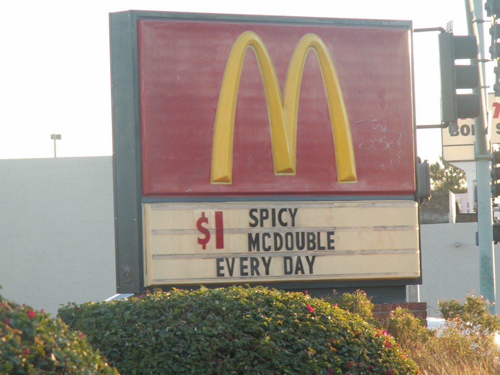
- Consistency – The usability of a system is improved when similar parts are expressed in similar ways. This is essential in branding, for instance – no matter what part of the world you’re in, when you see these special arches, you know you’re in for some questionable but undeniably delicious food.
Did any of these principles elicit your, “DUH”-reaction? What are some of the principles of design that you use that cater directly to basic human intuition?